Improving a website appears to be a continuous creative process in and of itself. Lately, I’ve been wondering how to remove some clutter and make things a little more organised and easier to navigate. Having implemented a bunch of improvements last week, I think I’ve succeeded in taking www.rickvanmeijel.com to the next level. Take a look below to see the new upgrades!
Home
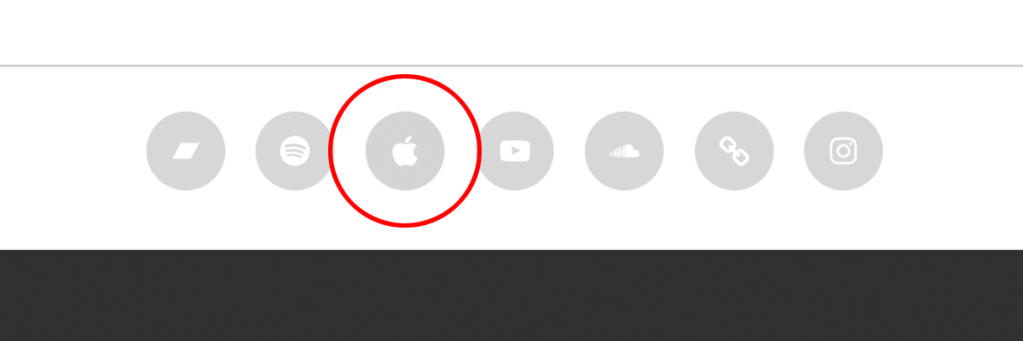
I cleaned up the home page and added my new logo to the bottom. The footer now also includes a permanent link to my Apple Music profile.
Blog
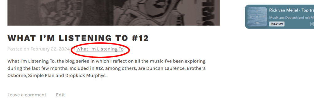
Formerly known as ‘News’, this page now lets you click on the category beneath each blog post title, making it easier to navigate and search through posts.
Music
This is where the biggest makeover occurred: I’ve transformed the page design into a clear tile layout, placing the artwork front and center. Click on one of my albums or singles and you’ll be taken to their corresponding Spotify, YouTube or Bandcamp pages.

Videos
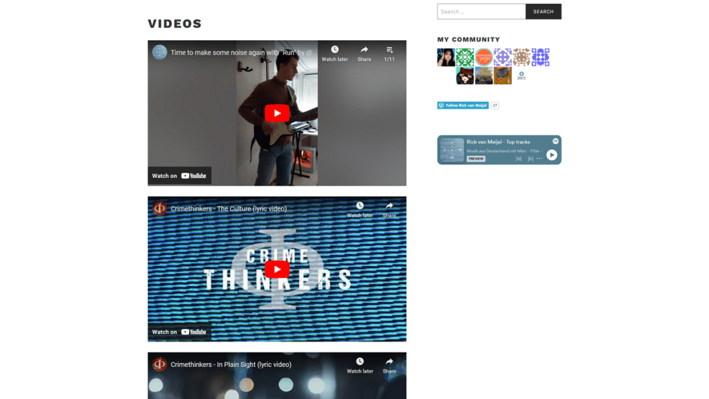
I removed the redundant video titles and added a playlist of all my guitar and keyboard covers. The playlist will automatically be updated every time I post a new cover video on my YouTube and Instagram accounts.
Bio
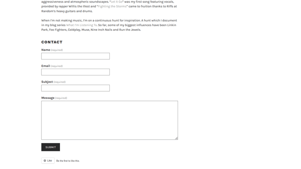
The bio page now also features the contact form at the bottom, in case you want to send me a personal message 🙂
Other upgrades
As you may have noticed, I decided to scrap the Gallery, Store and Contact pages altogether. I found them to be unnecessary, because you can always browse my artwork on Instagram or download my music on Bandcamp. In doing so, I think the website benefits by having a more compact feel and being more easily navigable. I hope you think so too!
If you have any suggestions for future upgrades, feel free to let me know in the comments. Check out the upgrades I previously implemented over here.
